New work
Energy Gummy Chews
Energy Gummy Chews
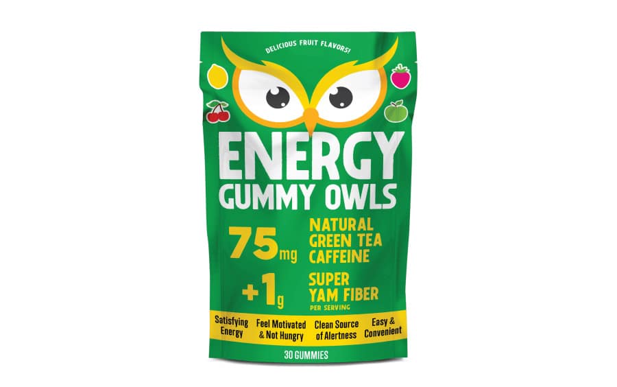
In a sea of energy products at C-stores, a new product must stand out from the competition. While most are targeted at men with a sporty look, this Energy Gummy product speaks equally to both genders and stands out with a more artisan design. The info on the front clearly conveys what it is and why it’s different.
Twice-Baked Cookies
Twice-Baked Cookies
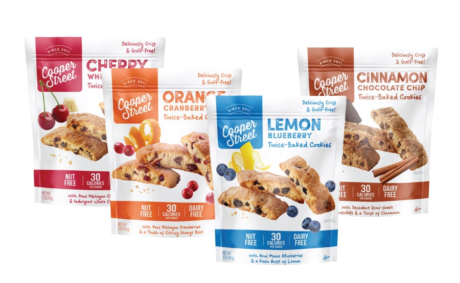
Jenn David Design revitalized this brand and cookie line with a fresh look that was an evolution of their old look so brand recognition was retained. This clean and minimalist packaging design appeals with big images, fun colors and clear information on key selling points. We also designed Cooper Street’s other cookie line as well as their website.
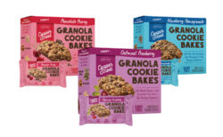
Granola Cookie Bar Bakes

Granola Cookie Bar Bakes
This was a brand and packaging redesign where we retained brand equity by making the brand revamp an evolution of the previous version. The previous packaging for these granola bars was underperforming and had too much info all over the place so that the most important selling points were obscured. We brought in big color, bold type, big images, and organized the selling points to convey only the most important ones on the front and secondary ones on the back.
We rolled out the new cookie packaging design to boxes, POP display caddies, individual wraps and clamshell packaging. Jenn David Design also designed Cooper Street’s other cookie line as well as their website.
Caramel Corn
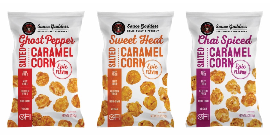
Caramel Corn
This caramel corn combines the amazing spice blends that Sauce Goddess creates with caramel corn. A fresh take on a traditional treat! Our design is clean and modern, with bold color to clearly differentiate, and an element of fun and whimsy with popcorn playfully placed throughout the pouch.
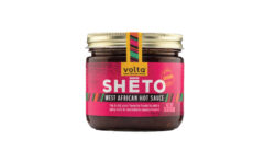
Sheto West African Hot Sauce

Sheto West African Hot Sauce
Sheto is a traditional condiment commonly used in West Africa. Volta Foods wanted to launch their modern take on this traditional sauce in the US to a mainstream market, in addition to ethnic markets. As such, the label really needed to stand out in a fresh way and inform on what it is and how to use it! Bold, bright colors and a stripe motif reminiscent of traditional West African clothing conveys heritage and proud culture in a way that is interesting and informative to a new audience.
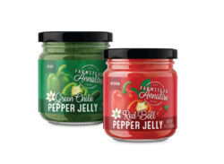
Pepper Jellies

Pepper Jellies
We love helping new brands launch! Farmstead Annalise is a fresh new brand with a modern country elegance. This pepper jelly label stands out, is colorful, fun and features beautiful pepper-and-flower images. Jenn David Design also designed the logo.

BBQ Sauce
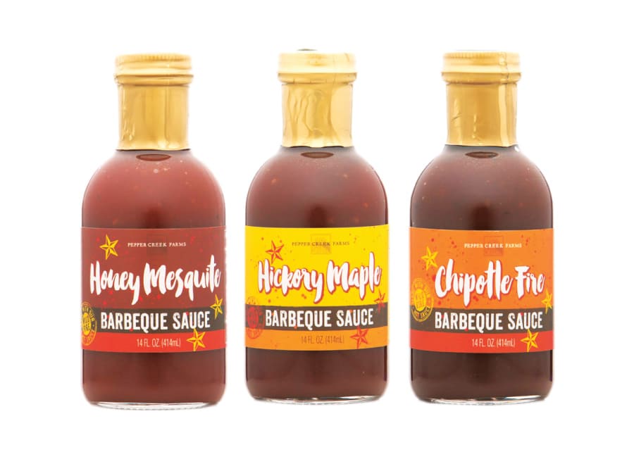
BBQ Sauce
Barbeque sauce is a crowded category, so we used bright color and bold, handwriting font along with artisan stamp images to stand out on the shelf from the competition.

Healthy Breakfast Smoothie Mixes
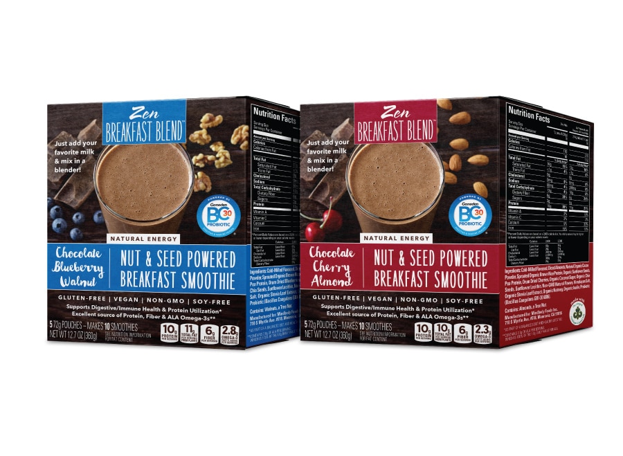
Healthy Breakfast Smoothie Mixes
We designed this specialty healthy smoothie box and pouch packaging to convey natural and healthy, as well as clearly conveying how to use it and why it’s different. Jenn David Design also designed the logo and website.

Dip & Spread Mix
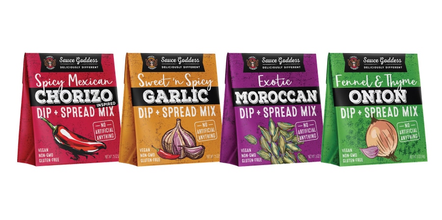
Dip & Spread Mix
We designed this colorful and fun dip and spread mix packaging design to work as a seasonal, holiday or year-round product. Bold color and large images and type stand out and read easily from afar on this small sachet package.

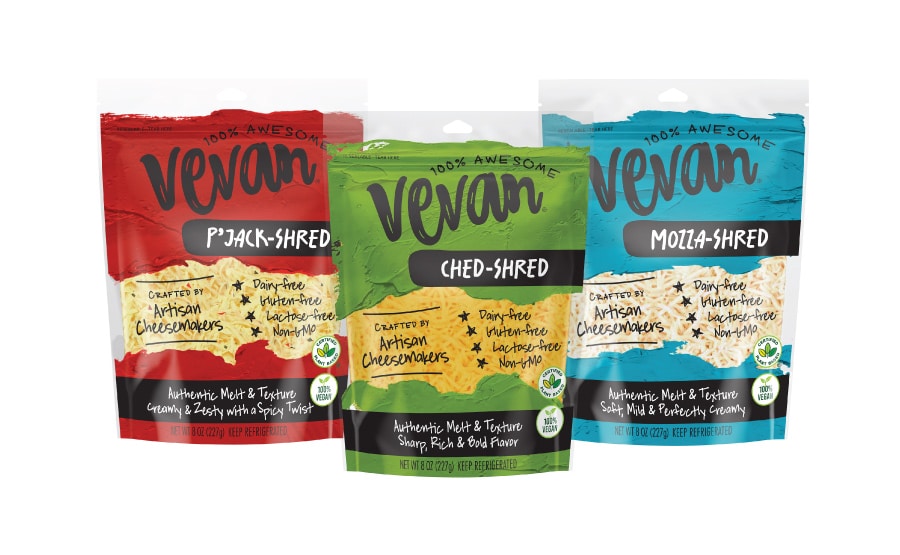
Vegan Cheese Shreds & Slices
Vegan Cheese Shreds & Slices
We designed the Vevan brand to be different from the start. After all, crafting a vegan cheese this good is an art form. Bold, colorful paint backgrounds and handwritten type convey the premium craft, and this design stands out from the competition in every way. Vevan is a taste revolution and it shows from the first sight. Jenn David Design also named this brand and created the hand-lettered logo.
Blue & Gorgonzola cheese
Blue & Gorgonzola cheese
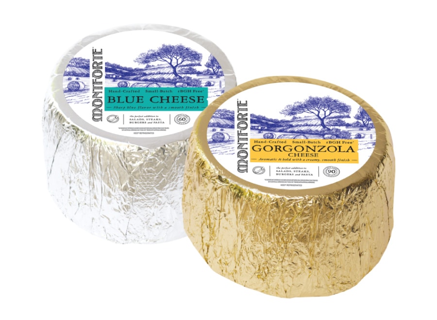
We helped roll out this line of products from Montforte, creator of premium blue and gorgonzola cheeses. The packaging consisted of fill wheels, wedges, and printed cups. Jenn David Design also designed and developed the Montforte website.
Hand-rubbed Fontina Cheese
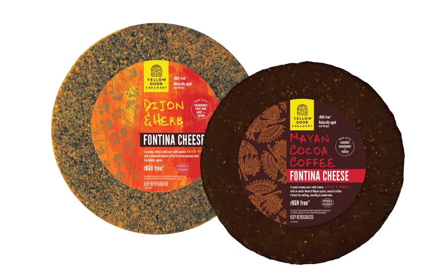
Hand-rubbed Fontina Cheese
Jenn David Design created the look for this premium cheese line and designed the line of products consisting of full wheels, wedges, repack labels, and more. The line also includes seasonal flavors that have a different seasonal design while still fitting in with the year-round family line look.
Flavored Sugars Package Design
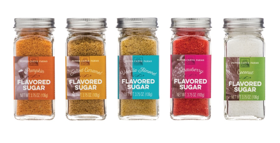
Flavored Sugars Package Design
We designed this flavored sugar to be upscale yet approachable with a touch of fun. Bold colors clearly differentiate the flavors along with a sepia flavor image snippet on each for added sophistication.
Salt & Pepper
Salt & Pepper
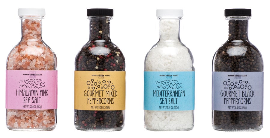
We designed these salts and peppers for Pepper Creek Farms to be colorful and fun as an interesting complement to the classic and timeless look of the stout jars.

Exotic Sea Salts
Exotic Sea Salts
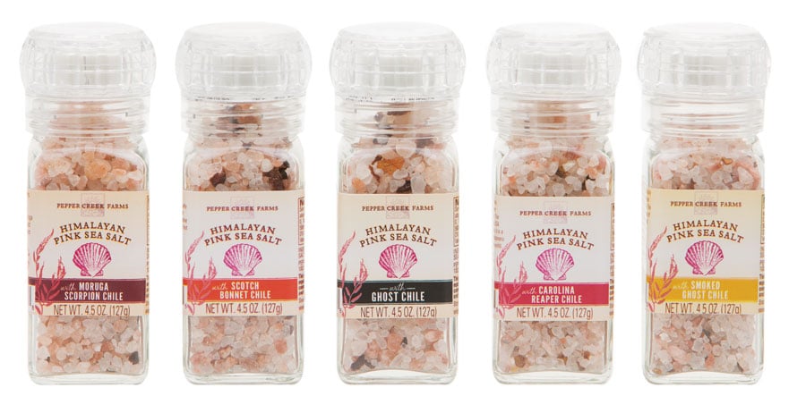
We designed these grinder sea salts for Pepper Creek Farms to be classic and timeless with the name of each exotic hot chili pepper featured prominently on the front.
Grinder Spices
Grinder Spices
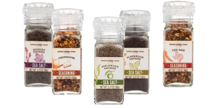
We designed these grinder spices and seasonings for Pepper Creek Farms to be classic and timeless, each featuring a vintage illustration of its signature namesake element on the front.

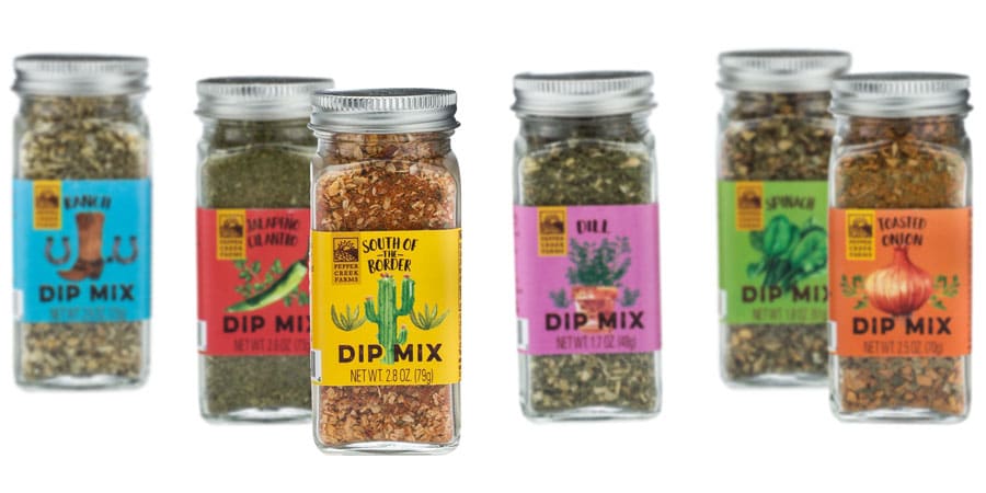
Dip Mixes
Dip Mixes
Bold, vibrant colors and unique images capture attention and connote the rich flavors of this dip mix line that we designed for Pepper Creek Farms.

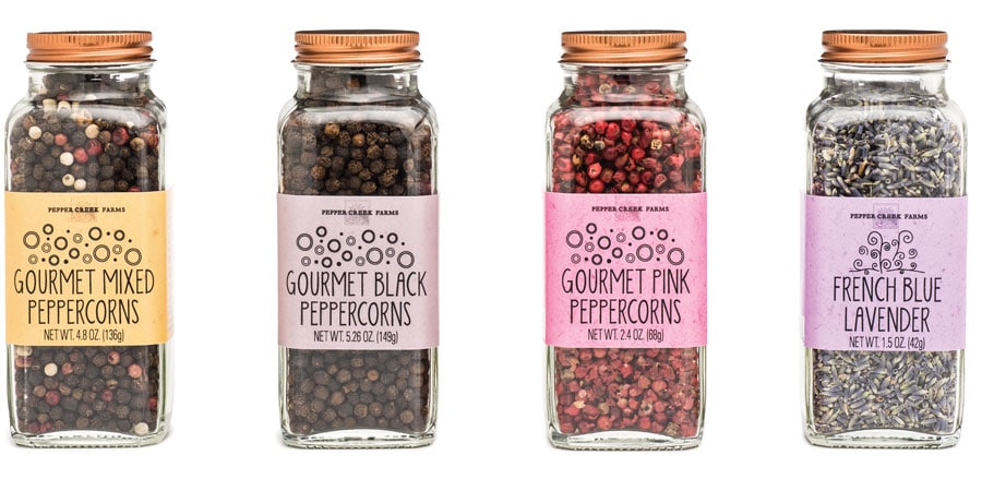
Spices Line
Spices Line
These classic square jars feature a modern copper metal lid and beautiful colors and textures of the spices contained within. Jenn David Design created this spice packaging design look to be fun, modern and handcrafted with a touch of whimsy for an interesting contrast against the classic, timeless look of the package itself.
Brining Spices

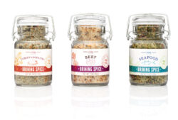
Brining Spices
Brining typically being done at the holidays, Jenn David Design developed a fresh, classic, and upscale look for this line of brining spices packaged in an old fashioned wire jar for Pepper Creek Farms.
Burdock and Lotus Root Chips

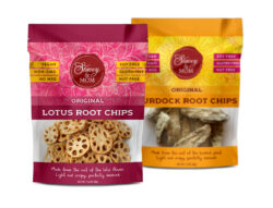
Burdock and Lotus Root Chips
We designed these colorful pouches for Stacey & Co. to feature a subtle asian-inspired background pattern and bold colors to stand out. The window shows the product though and key selling points prominently flank their iconic red logo, which we also designed.

Longevity Bars
Longevity Bars
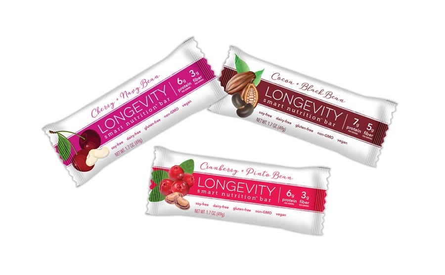
Jenn David Design developed the packaging design and branding for this line of healthy snack bars based on beans, which have been shown in studies to increase longevity of living, hence the product name Longevity. We also designed the caddy display box to go with it. The clean and minimalist yet colorful design lets the important information be the focus along with an eye-catching image of the fruit and bean type featured in each bar.

Pasta Sauces
Pasta Sauces
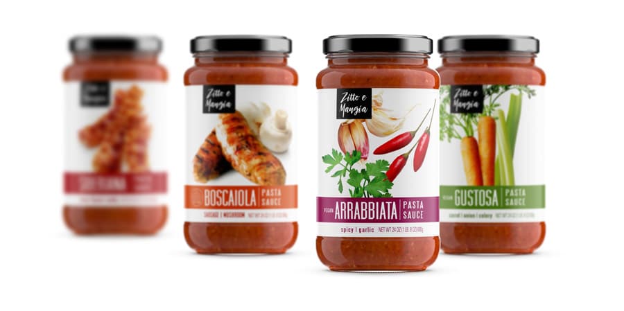
Jenn David Design created the packaging and logo design for the revamp of this product line.
Craft Jams & Sauces

Craft Jams & Sauces
Jenn David Design created the packaging, logo design and website for the launch of this new brand and line of gourmet sauces and jams.

Salsa
Salsa
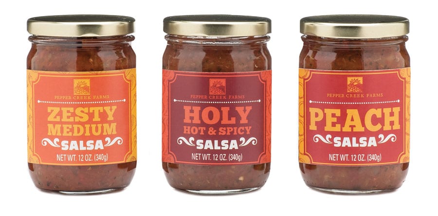
We designed these salsas for Pepper Creek Farms to be fun, bold and colorful to go with the bold flavors and fun names.

Salad Dressings
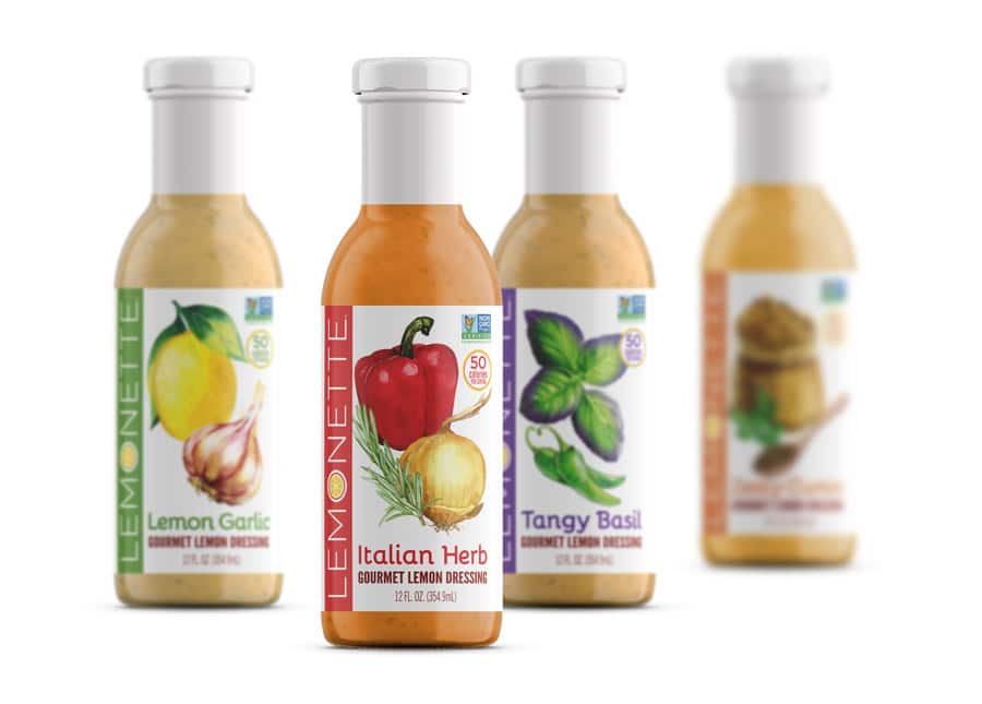
Salad Dressings
Lemonette had been doing well enough since their launch into market but was ready to improve their branding and packaging design to further their growth and market reach even more. Jenn David Design partnered with Lemonette on this revamp, evolving their look to be fresh and modern, and make more of a visual and strategic impact on the shelf. The re-launch was a success, furthering their reach into new stores and taking Lemonette from a regional to a national brand. JDD continues to partner with Lemonette on launching of new products.

Union Jack’s Tea

Union Jack’s Tea
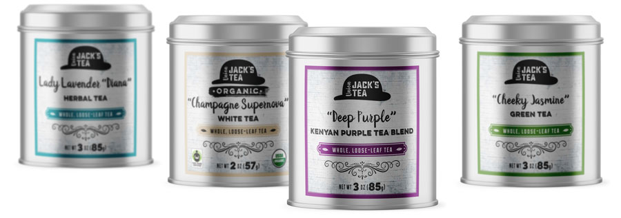
Union Jack’s Tea is all about the unique tea experience with a modern twist and an homage to tea’s English origins. Jenn David Design created their brand mark—modeled after the distinctively British bowler hat—as well as their retail tea canister design to launch this brand. The brand has been such a success that their first retail shop location has opened in Los Angeles and we couldn’t be prouder.

Union Jack’s Tea
Union Jack’s Tea
Union Jack’s Tea turned once again to Jenn David Design when they needed a design for a new line of teas that would be for foodservice—a more universal look to go with a wide variety of settings and restaurant brandings, yet one that was still uniquely Union Jack’s Tea. Jenn David Design had created the look for the main tea line design and welcomed the opportunity. The new design is clean and elegant and complements the main bold design look.
Curcumin Antioxidant Gummies
Curcumin Antioxidant Gummies
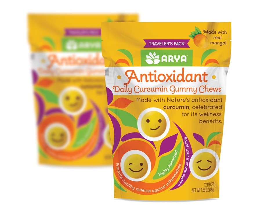
Arya partnered with Jenn David Design on launching their new Daily Curcumin Antioxidant Chews. As a family-friendly product, it needed to strike the right balance of freshness and fun with authentic wellness. The individual clear gummy wrappers have different faces designed on them for a fun twist, and that emoji concept is carried through on the main pouch as well.
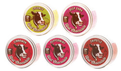
Hot Chocolate Mix
Hot Chocolate Mix
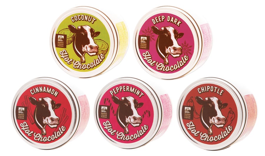
We designed these classic tins for Pepper Creek Farms’ hot chocolate mixes to be fresh, colorful and bold, each featuring an iconic cow face on the front flanked by signature flavor elements.

Dry Beans
Dry Beans
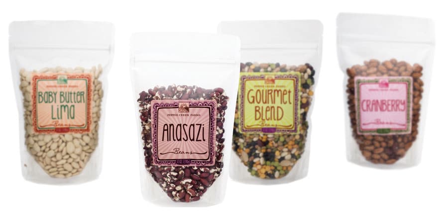
Jenn David Design developed a fun, quirky look for this line of dry beans to go with some of the unusual names such as Tongues of Fire!
Granolas, Dried Fruits & Seeds

Granolas, Dried Fruits & Seeds
Jenn David Design revamped Beaming Wellness’ snack line along with their extensive drink and salad lines. Not only did we upgrade their packaging design but we also made their labeling fully FDA compliant which had been lacking in their previous labeling. Information is clear and easy to read—which makes the line much more user-friendly—and highlights important certification logos and key selling points. Jenn David Design revamped Beaming Wellness’ snack line along with their extensive drink and salad lines. Not only did we upgrade their packaging design but we also made their labeling fully FDA compliant which had been lacking in their previous labeling. Information is clear and easy to read—which makes the line much more user-friendly—and highlights important certification logos and key selling points.
Frozen Fried Rice

Frozen Fried Rice
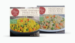
Jenn David Design partnered with Stacey & Co. to design these boxes for two varieties of frozen fried rice. We also designed their iconic red logo. The boxes feature a large beautiful product photo on the front with key selling points and their brand and product story with instructions on the back.

Drink Rimmers
Drink Rimmers
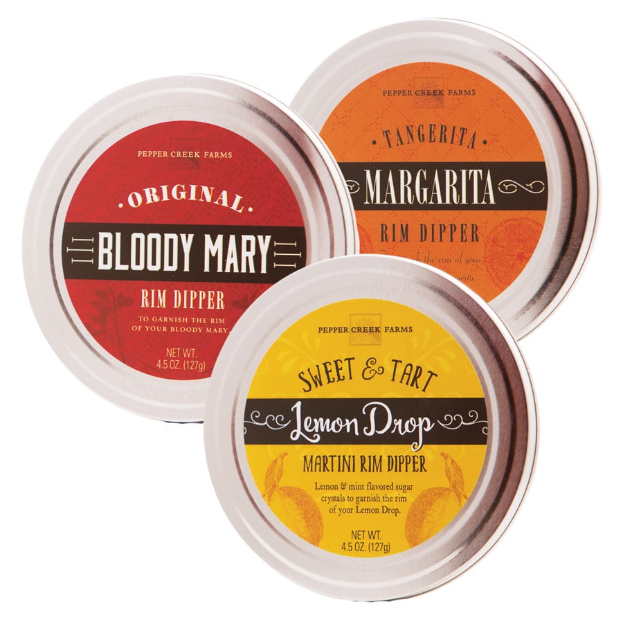
Jenn David Design adapted the drink mixer design we did for Pepper Creek Farms to this line of corresponding drink rimmers in tin cans.
Drink Mixers
Drink Mixers
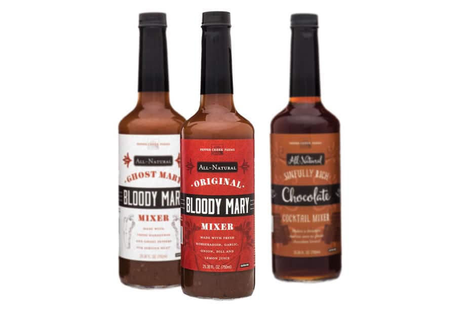
Jenn David Design developed a classic yet fresh look for this line of drink mixers for Pepper Creek Farms.
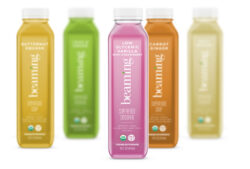
Juices & Smoothies

Juices & Smoothies
Beaming Wellness was ready to revamp their extensive line of juices and smoothies and turned to Jenn David Design. Not only did we upgrade their bottle packaging design but we also made their labeling fully FDA compliant which had been lacking in their previous labeling. Information is clear and easy to read—which makes the line much more user-friendly—and highlights important certification logos and key selling points. Along with their drink line, JDD also revamped their salad and snack lines.

Solid Milk Chocolate Pouch
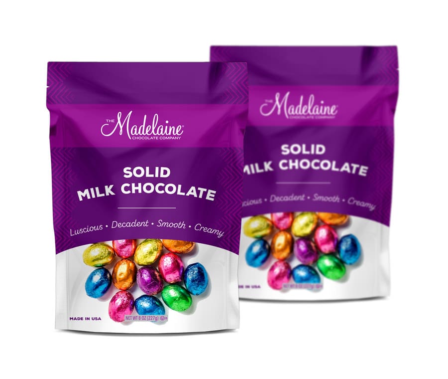
Solid Milk Chocolate Pouch
We designed this pouch for Madelaine Chocolate Co. to feature their signature purple brand color and show off the beautiful foil chocolates contained within. The pouch is universal to over 100 types of solid milk chocolate candies, with the information for each being customized with a label on the back of the pouch.
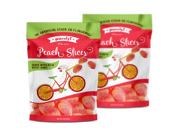
Gummy Peach Slices

Gummy Peach Slices
We designed this pouch of Gummy Peach Slices for Purely! to be fun and whimsical, with a focus on the natural aspect as a point of differentiation.

Christmas Sprinkles

Christmas Sprinkles
We designed this set of Christmas sprinkles for Pepper Creek Farms to be fun, eye-catching and colorful. Each label design complements the individual product colors and also works together as a set.

Valentine’s Sprinkles
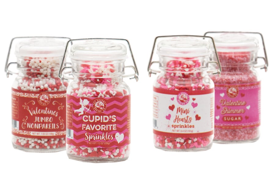
Valentine’s Sprinkles
We designed this set of Valentine’s Day sprinkles for Pepper Creek Farms to be colorful and fun, complementing the vintage wire jar container and the beautiful product contained within.
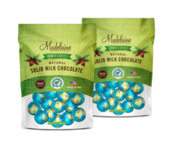
Organic Chocolate
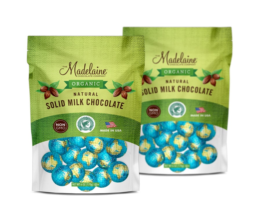
Organic Chocolate
Jenn David Design has been partnering with Madelaine Chocolate Co. since 2015 on various premium chocolate packaging designs. This Organic chocolate pouch design accommodates a variety of products, with each product’s details being customized on the back with a label.

Chocolatey Dipped Wafer Rolls

Chocolatey Dipped Wafer Rolls
Jenn David Design partnered with Fusion Gourmet to design this line of Chocolatey Dipped Wafer Rolls for their brand Sofiato. Clean and minimalist, the design features a photo of the product as its focus to show that they’re filled with flavorful cream in the centers. The bold colors and callouts highlight each different flavor fill.

Coconut Cremes
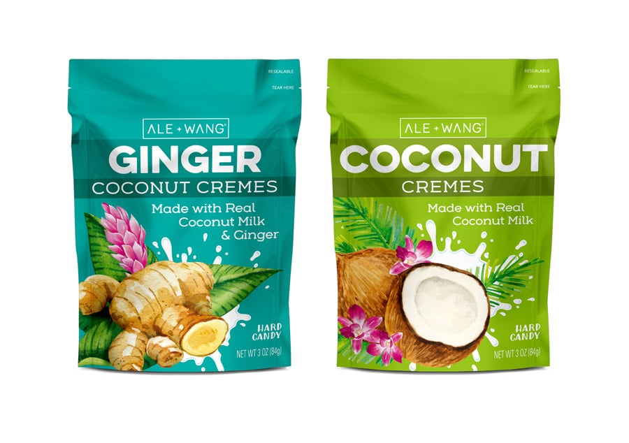
Coconut Cremes
Ale & Wang searches the world for only the very best ingredients for their coconut creme candies, and it shows from the first taste. They turned to Jenn David Design to launch their brand and product line. To disrupt the candy category with a quality candy with incredible flavor, JDD developed a bold, fresh look with a large custom illustration and coconut milk splash as its main focus. Their entry into the market has been a successful one and they continue to partner with JDD on launching of new items in the line and other candy lines.

Body Salt Scrubs
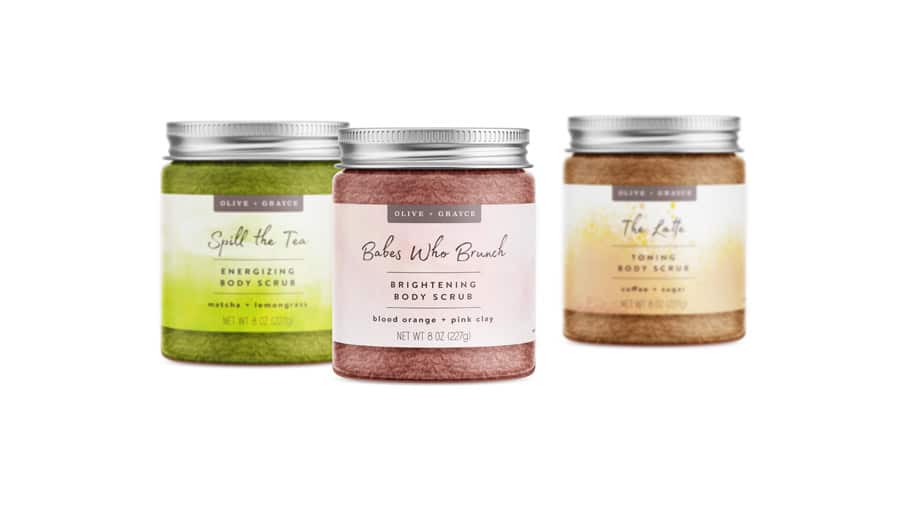
Body Salt Scrubs
Jenn David Design developed the logo and packaging design for this line of artisan body scrubs by Olive + Grace.

Rooibos Body Cream
Rooibos Body Cream
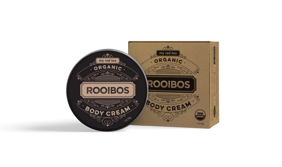
My Red Tea makes authentic rooibos tea products and branched out to body care with this rooibos-infused body cream. Jenn David Design translated their tea packaging design (which JDD also did) into a complementary but distinct design for this kraft box packaging and jar labels. We also adapted this design for My Red Tea’s Baby Bum Cream.
Baby Bum Cream
Baby Bum Cream
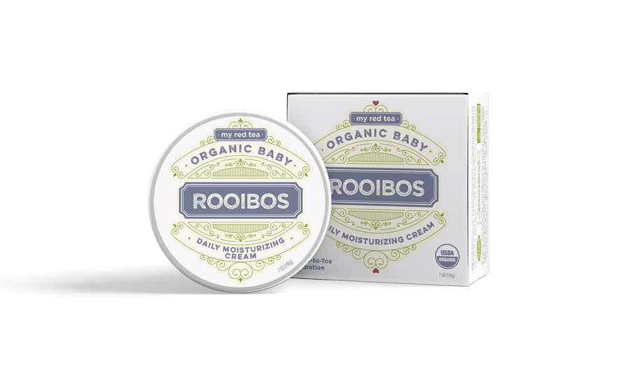
After developing My Red Tea’s iconic Rooibos Tea packaging design, JDD extended that brand look into their body cream and this Baby Bum Cream.

Edible Glitter
Edible Glitter
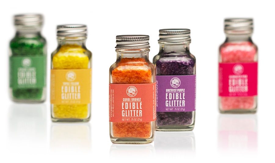
Pepper Creek Farms developed this edible glitter product to enhance its vast line of gourmet baking decorations. The small jars and bright, fun colors called for a design that embraced and enhanced the product’s colorful impact. We kept it simple with matching saturated colors and clear, bold type.

Cloumage Cheese
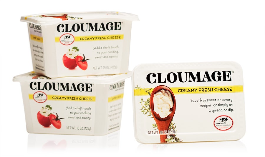
Cloumage Cheese
Shy Brother’s Farm turned to us to design the packaging for their new soft cheese, Cloumage. A new cheese type, educating the consumer on what it is and how to use it was essential to its success. The images and suggested uses clearly demonstrate this, and the new packaging has been a hit, getting them into Whole Foods among many other specialty food stores.

Coconut Butter
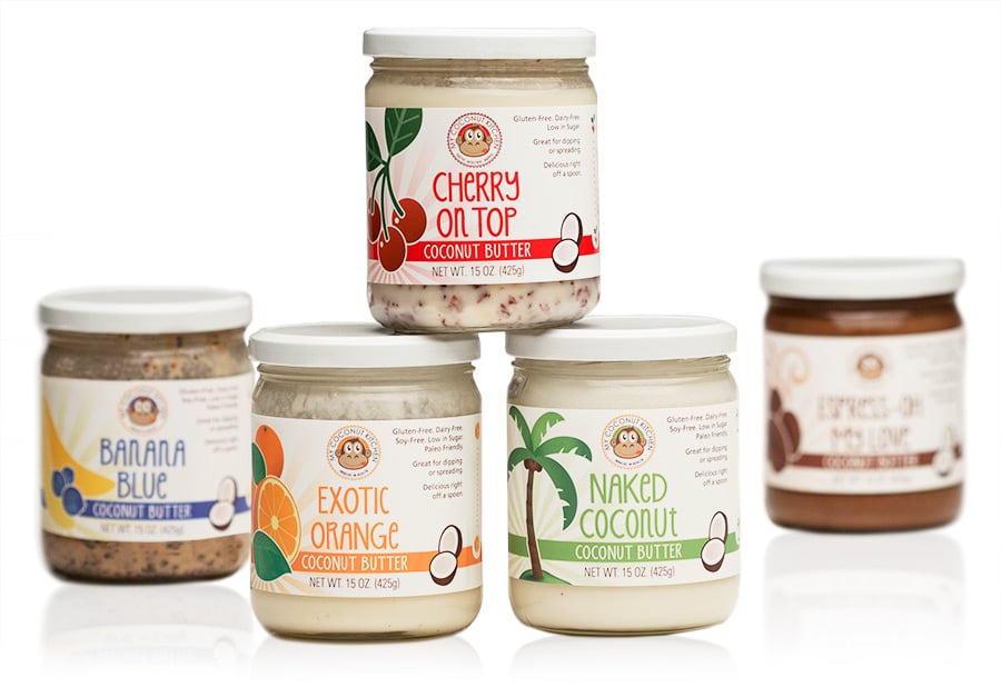
Coconut Butter
My Coconut Kitchen was ready to advance from local farmer’s market retailer to distributing in gourmet chains such as Whole Foods. We helped them achieve that by developing an energetic, upscale packaging design based around their existing fun, quirky branding. Usage suggestions and key selling points highlight the versatility and health benefits of the product.
Snack Croutons

Snack Croutons
Snack’ons broke into the snack market with an unusual take on croutons—exciting flavors of croutons you can snack on. Innovative packaging was essential to grab attention, yet it needed to be easy for the consumer to use and reuse. We led them to the reusable plastic cup solution, and developed the identity and design to go with it.
Gourmet Flavored Syrups
Gourmet Flavored Syrups
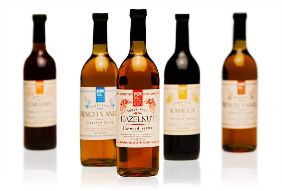
Having worked with Pepper Creek Farms to design literally hundreds of their products over nearly a decade, we were thrilled to develop this high-end flavored syrups design for them. The consistent cream background lends a sophisticated feel you might find on wine packaging, and the bold colors signify the different flavors in the line.
Wafer Roll Cookies

Wafer Roll Cookies
We developed this holiday canister packaging design for the Dolcetto’s line of packaging to boost holiday sales as a limited-time seasonal design. A signature holiday red color pairs with cream and brown accent tones for warmth and a chocolatey vibe, while the background patterns add fun and excitement while differentiating the flavors.

Chocolate Foil Wrap
Chocolate Foil Wrap
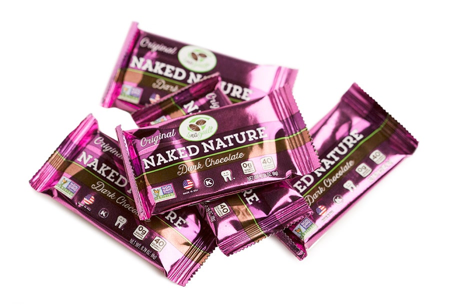
After developing Healthy Chocolate Co.’s 4NoGuilt pouch packaging for their Naked Nature line of dark chocolates, we did the individual piece wraps that go inside the pouch. Since the pouch has a window, the wraps needed to be stunning. We let the natural shine of the foil come through, using opaque white ink selectively for matte areas for contrast. All the health callouts are on the front of this tiny package, with nutrition facts and other required information on the back. It was no small feat to make it all fit legibly!

Organic Rooibos Tea
Organic Rooibos Tea
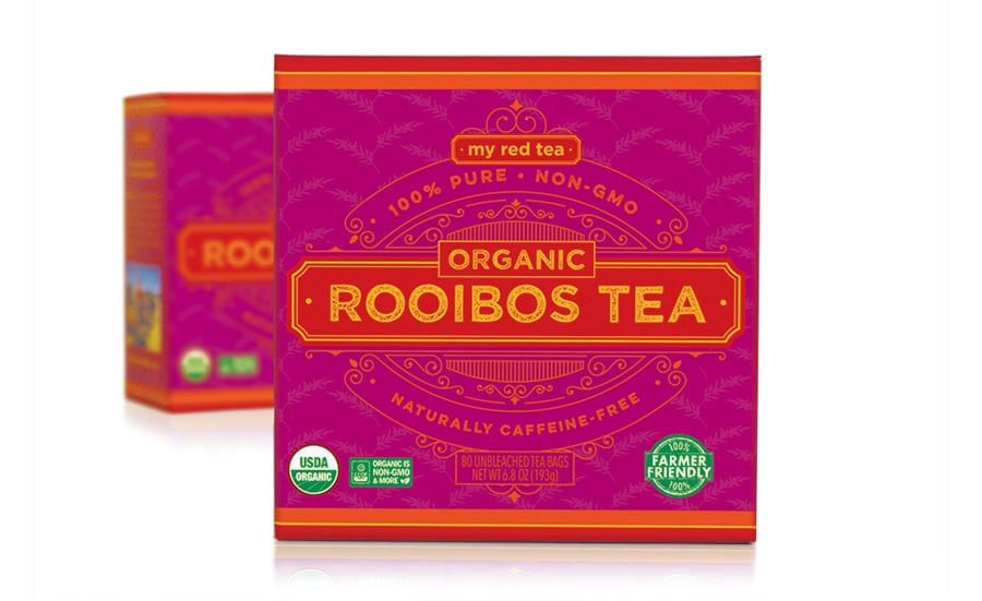
We partnered with My Red Tea to establish their new brand and launch their organic Rooibos Tea product line. An authentically South African product, we embraced the colorful and vibrant art style of the area as an inspiration for this tea packaging design. Essential callouts highlight the key selling points while telling the brand story to further the emotional connection to the brand.
Gourmet Popcorn
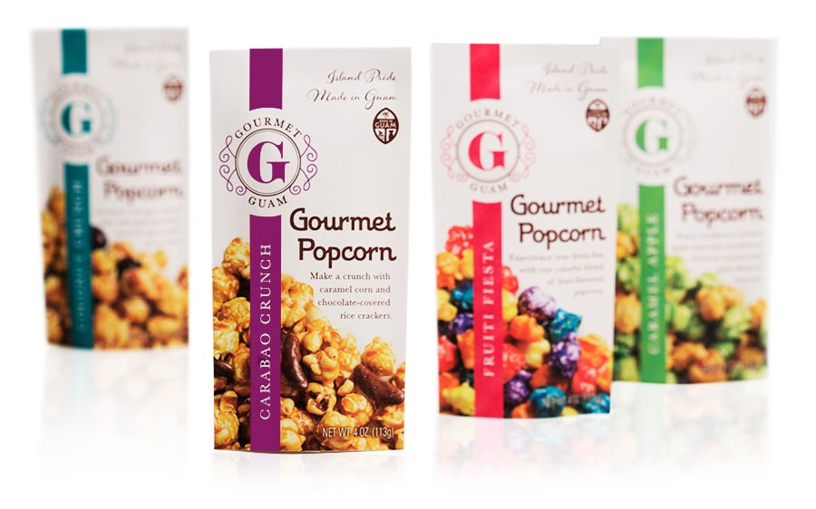
Gourmet Popcorn
Gourmet Guam sells premium popcorn made locally in Guam primarily as a souvenir for travelers, in high-end duty-free stores. Their previous packaging was a stock pouch with a window which looked generic, and the window wasn’t protecting the product well. We helped them upgrade to a new foil pouch with a sleeker profile and custom design, showcasing their handcrafted popcorn in an exciting and appetizing way. We also developed their new logo mark.
Craft Jams & Sauces
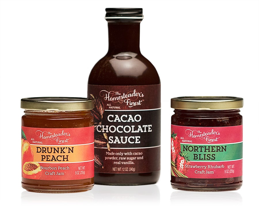
Craft Jams & Sauces
The Homesteader’s Finest had been successful in their local farmer’s markets and were ready to take their business to the next level. We helped them transform from their amateur look to the artisan upscale gourmet brand that they already were. They have since gotten into many gourmet retailers and are in discussions with Whole Foods. We also developed their new logo mark and website, and continue to support them as they roll out new products.

Bibimbap & Japchaeya
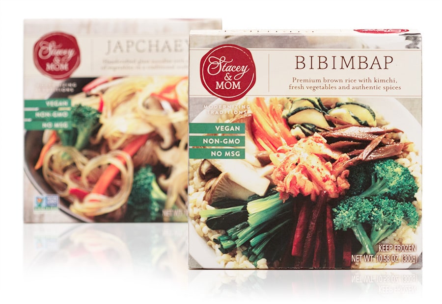
Bibimbap & Japchaeya
Stacey & Mom came to us to develop their branding and packaging design for this new line of vegan Korean frozen foods. Made with premium ingredients and visually appealing, we kept the stunning entrees as the center focus of the packaging, and designed an upscale look that enabled them to get into Whole Foods.
Soft-Baked Biscotti

Soft-Baked Biscotti
After designing Marlo’s original packaging in the custom box shape we developed, we helped them roll out their next flavor in this boxed line. This line has been a huge success and they’ve only been growing since.
Raw Crackers
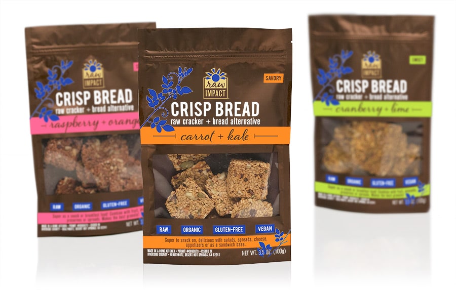
Raw Crackers
Raw Impact came to us to develop their branding and packaging for their new line of raw crackers/crisp bread. The resealable pouch with window shows off the beautiful product while being protective and convenient. We used metallic gold for a little pop, and bright, bold colors to easily signify the flavor differences. The packaging has been a success in helping them make a powerful entrance into the raw snack sector.
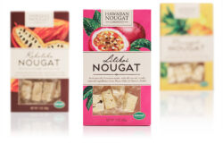
Gourmet Nougat

Gourmet Nougat
Hawaiian Nougat Co. makes an amazing authentic nougat with locally sourced ingredients. Their previous cello bag packaging looked unplanned and amateur, not conveying their gourmet status or any important selling points—not to mention it didn’t protect the product well. We developed this sophisticated box packaging in eye-catching colors, with illustrations that highlight each signature flavor. The verbiage communicates the important aspects of the product, reinforcing the premium price point. Whole Foods loved the new packaging so much that they retail them on a large endcap display.

Cello Whisps

Cello Whisps
We’ve been working with Schuman Cheese since 2014 when they came to us to develop the packaging design for their new line of pure cheese snack crackers. Already a huge presence in hard cheese manufacturing in the US, this was their first foray into the snack market. You can now find Cello Whisps in major stores across the US and Canada. We continue to work with their innovation department as they roll out frequent new products.

Naked Nature Dark Chocolate
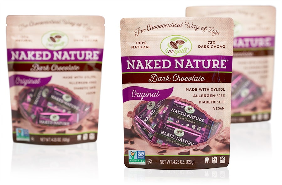
Naked Nature Dark Chocolate
Healthy Chocolate Co. needed a new design for their line of “healthy” chocolates sweetened with xylitol. Branding it under their 4NoGuilt product line, we developed premium packaging that enabled them to take the next step in their business which is going into retail stores such as Whole Foods.


