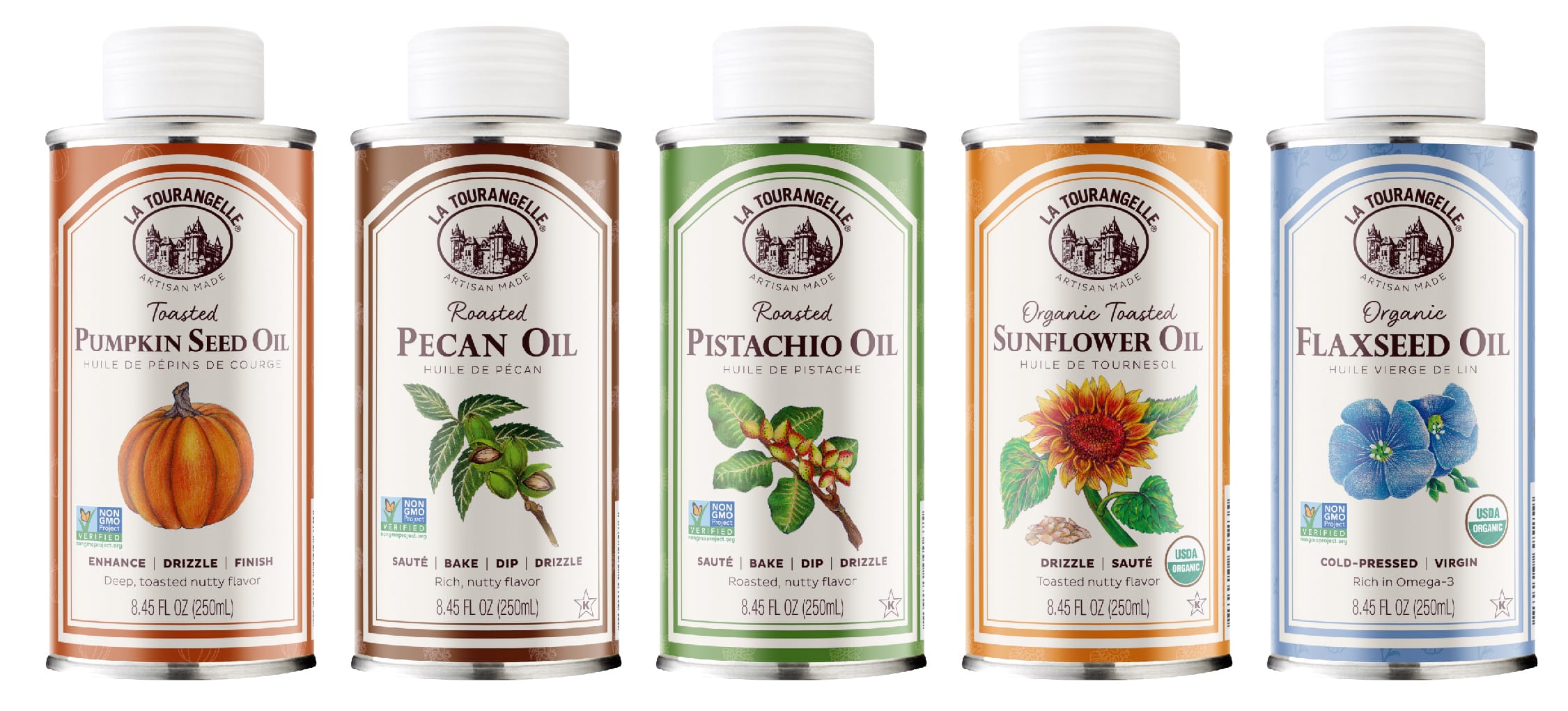
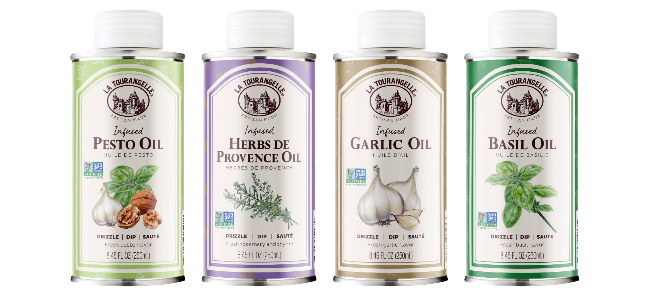
We recently refreshed the food brand of one of our longtime partners, La Tourangelle, maker of artisan oils. It’s a great case study of an established and very iconic brand. We designed this artisan oil packaging design nearly two decades ago and have been partnering with the brand since. The challenge was to freshen up the brand, yet retain the iconic look that it has become known for. After so long in the market with the original design (and countless products in the line that we have helped roll out within the same core look since), we all agreed it was time for a little sprucing up.
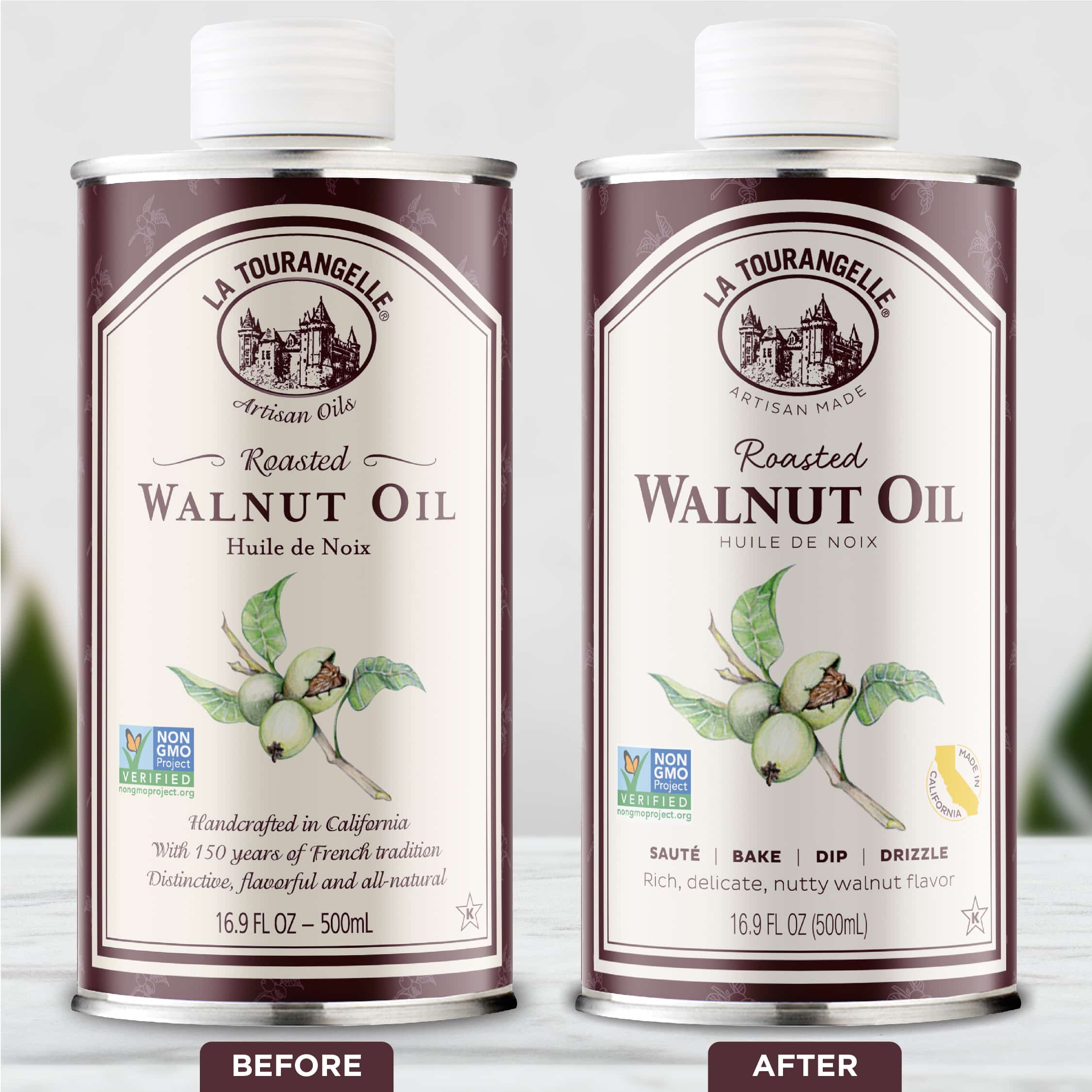
The result is so subtle that it might go unnoticed to the average consumer. Yet it has a definitively fresher, relevant, and more vibrant feeling. When you drill down to all the changes we actually made to this food brand identity, it was quite a massive overhaul. So, how do you successfully refresh a food brand? Read on to find out!
Refreshing an iconic food brand.
Were we daunted by doing a food packaging refresh for such an iconic brand? Not at all—we love a good design challenge! It is also thrilling to refresh a successful food packaging design we did long ago, and is a testament to the strength of our design partnership. We were honored that La Tourangelle entrusted us to handle this for them.
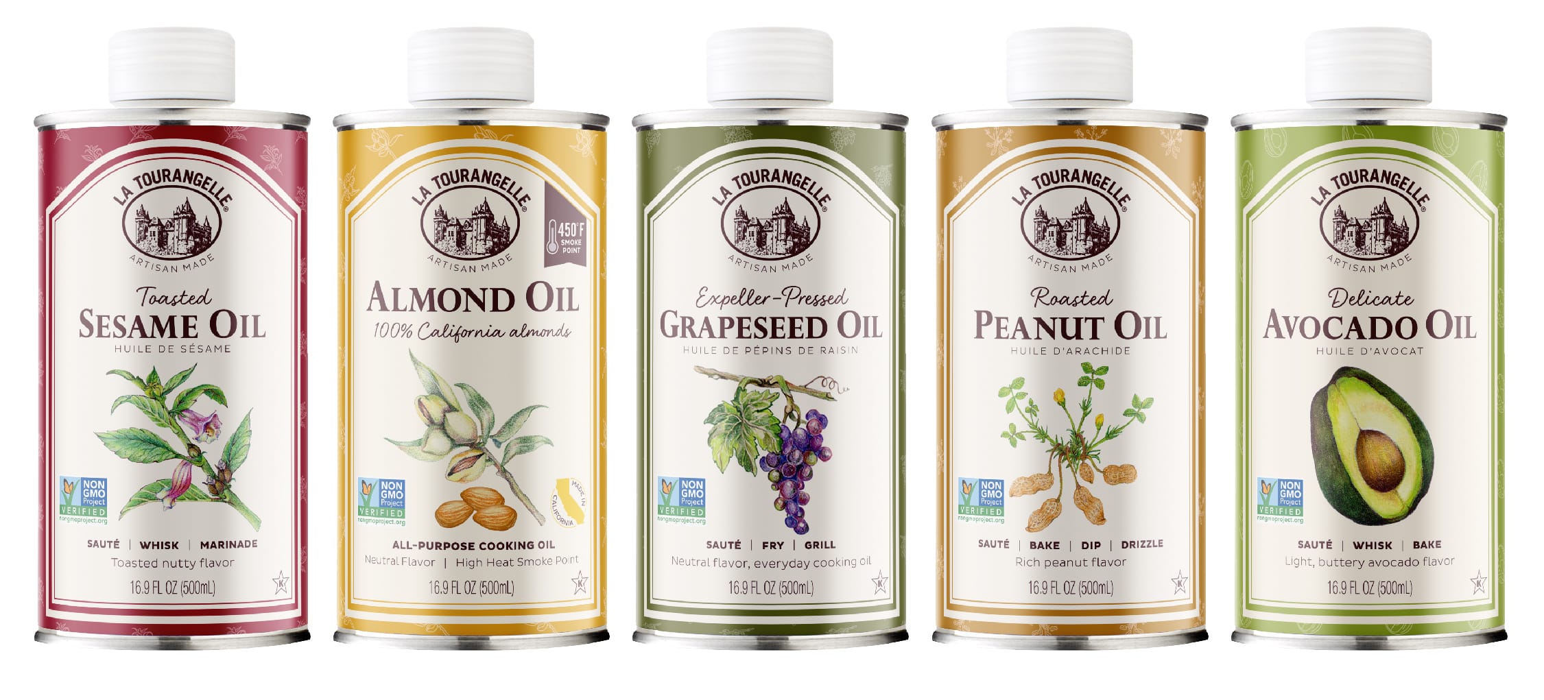
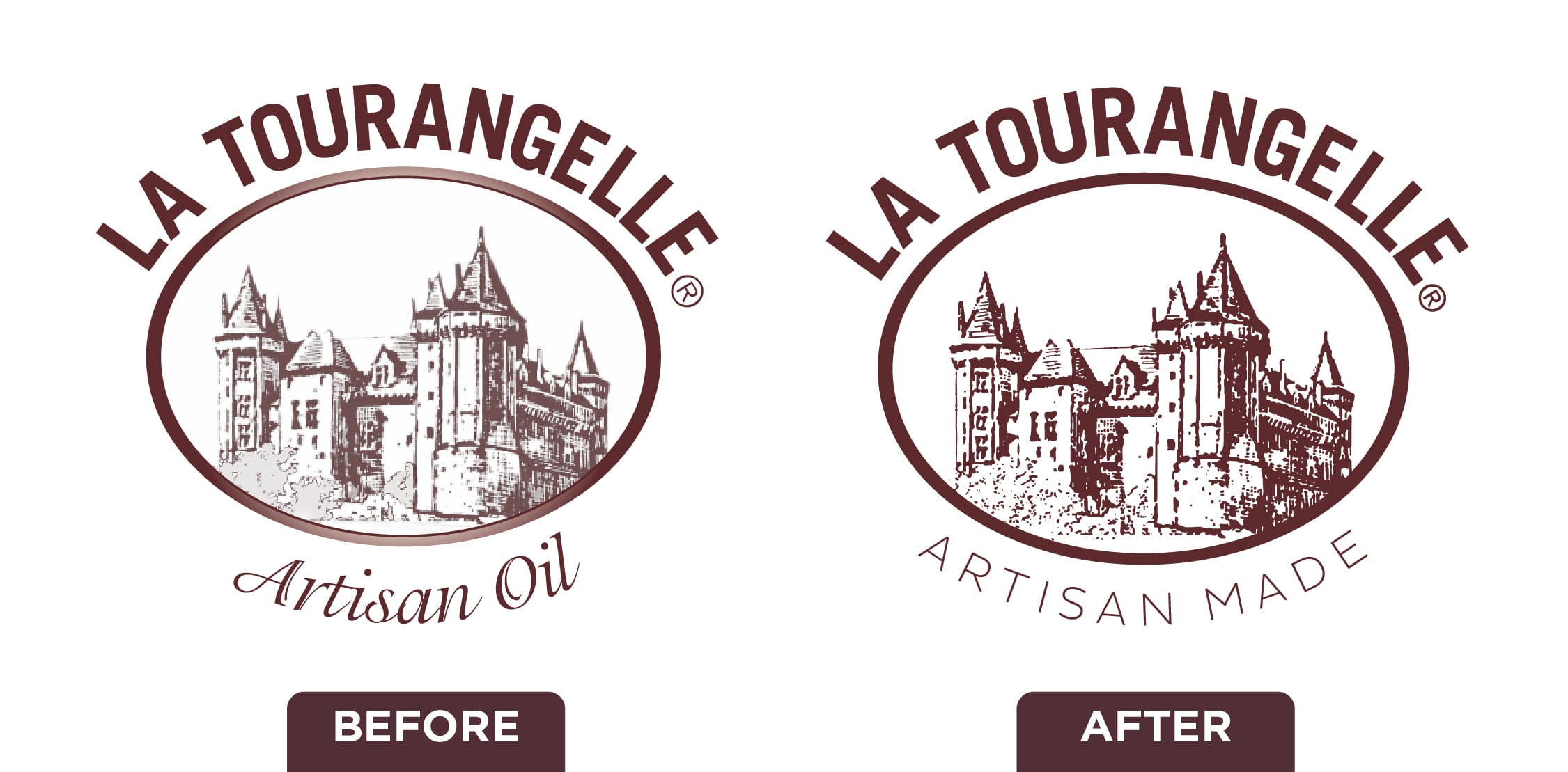
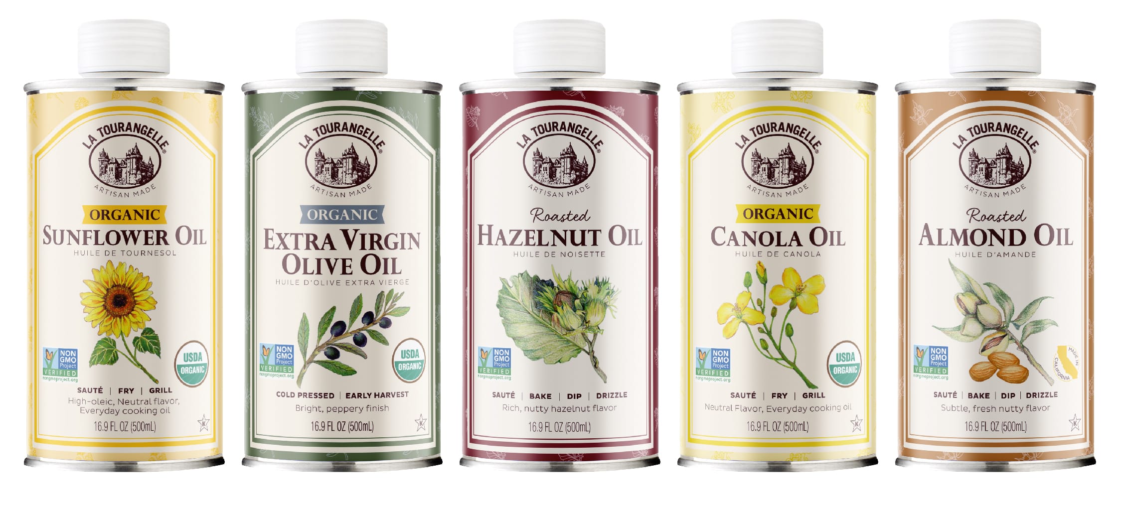
What’s included in a brand refresh? We started by assessing what works. La Tourangelle is very recognizable with their tin cans (which are more eco-friendly than heavy glass, and help to preserve the oil better), castle logo, curved plaques, vintage-style pattern and illustrations, and bold colors. For the most part, we did not touch these elements. The one exception we did make was to the food brand logo. We updated the brand tagline and selected a new font. We also made some subtle changes to the castle logo so it prints better.
What needs to go?
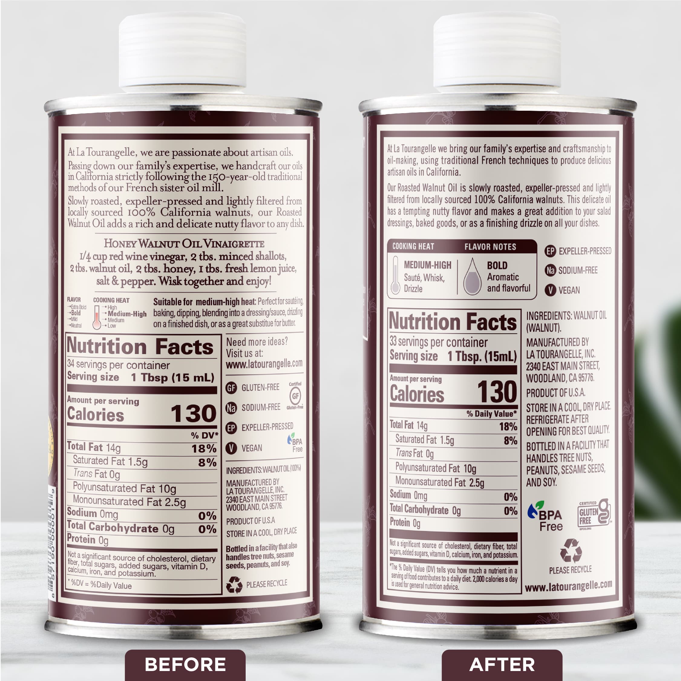
Next, we looked at aspects of the food packaging design that are no longer serving the brand. The packaging fonts were starting to feel slightly dated, so that was an obvious choice. We updated the messaging entirely to better communicate key selling points, and usage suggestions that are more relevant in today’s market. We also updated the entire back panel to better communicate aspects of the brand and product. The back panel on each oil package has a box with icons that denote flavor and cooking temperature. This makes it easy to compare among the oils in the line at a glance (there are many!).
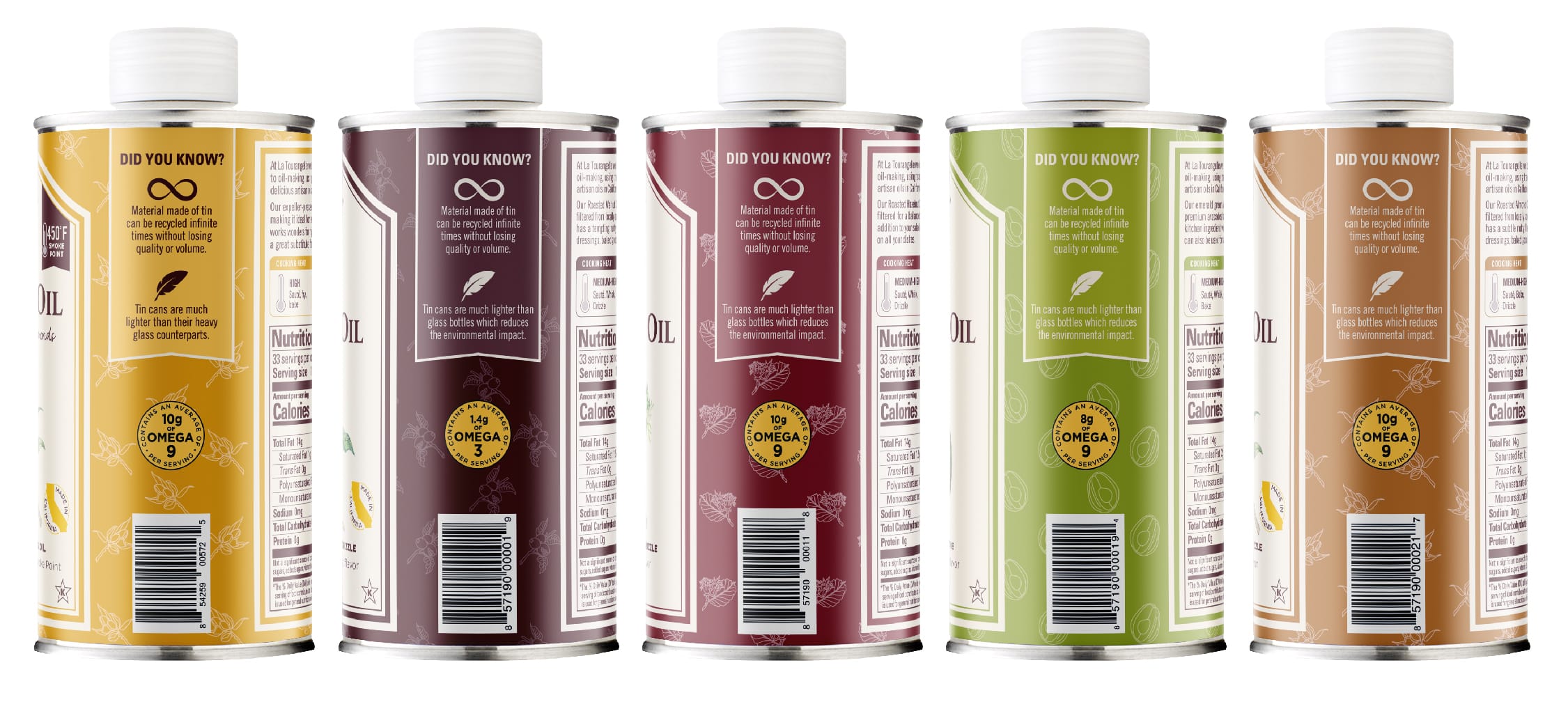
We also added a side flag panel that calls out the importance of the tin can and why La Tourangelle uses it. This highlights La Tourangelle’s strong commitment to sustainability, which is a core value that they put into action in many ways.
Design evolution versus redesign.
This entire project is a perfect example of a design evolution, which is when we take an existing design and evolve it to feel fresh and modern. It can be subtle, as we did here, or it can be more dramatic. I love that the refresh almost goes unnoticed on the shelf because the core La Tourangelle look is so very strong and dominant. Those iconic elements still take center stage in the improved food packaging, and everything else falls right into line. As old inventory is used up and new inventory flows in, the old and new designs blend seamlessly on the shelf for a smooth transition.
If you’re wondering more about what is the difference between a rebrand and a refresh, and which one you may need, read more about that here.
How often should you refresh a food brand?
It may be obvious if your brand needs freshening up. You may have clear signs such as falling sales, or store buyers or distributors telling you your product is great but your packaging design needs improvement. Otherwise if things have been going well, you’ll likely know when the time is right for an update. If your food product has been in the market a long time, and the time feels appropriate for some change, then start looking into it. If you have to make packaging design updates for other reasons, such as compliance or adding new certifications or a new formulation, consider whether it’s also a good time to make some updates to the look and messaging. I recommend assessing your food brand on a yearly basis to see what tweaks might be needed, if any.
How do I start my food brand’s design refresh?
If you already have a food brand design agency partner that you fully trust, then start the conversation with them. Get their input early on, since they know your brand well. Next, you’ll want to do similarly as described above. Assess what is working and what is not working to determine ways to improve your food packaging and branding. This forms the foundation for moving forward. What specific goals are you looking to attain? Get clear on those too. How can you improve your messaging? What key points and information can you give that will better close the sale? If you don’t already have a design partner and are looking to level up your brand, it’s time to commit to working with one going forward as an investment in your brand’s success.
The power of a great partnership.
You don’t want to work with an order-taker who is looking to you to tell them what to do. Although you may have built a successful company and created amazing products, unless you’re also a food packaging designer, leave that part to the experts. You bring the objectives, goals, and information pertinent to your brand, product, competitors, etc. A true partnership is one where your design partner guides and leads your team with best practice recommendations. A great design partner brings strategy, innovative thinking and creativity, so you don’t have to attempt to figure everything out yourself (and have lackluster results from not working with an expert).
The power of great design.
Why is food packaging design important? Design has the ability to make or break your food brand. It either works in your favor, or it works against you. Like anything else, design is something that needs to be maintained over time, as aesthetics, the marketplace and consumer values change. A food brand needs to remain fresh and relevant, or risk being left behind as competitors take the lead. As your brand evolves and grows, so should your design and brand identity right along with it.
Does your food brand need a refresh? Get started here.


Great article Jenn. As always, you have the ultimate eye for success where the brand is concerned.