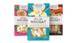
Consumers like to see what they’re getting before they buy, especially in the case of food. If your product comes in a clear container, pouch or bag, they will easily see what they’re getting through the container, and can judge the quality for themselves. Either a label is applied and the product is visible in the area surrounding the label, or if the artwork is printed directly on the container, the design can create a “window” by leaving space that is unprinted.
But what if your product is packaged in a container that does not allow for the product to be seen, or a die-cut window is not an option? Or, your product can be seen, but the part that is revealed does not reveal the main part of the product? In these cases, is it better to show a photo of the product on the front of the package? Let’s take a look at this further.
Seeing is believing. Our own studies have shown that consumers are more likely to buy when they can at least see the product in some manner—whether actual product, part of the product or photo. Otherwise the consumer is buying blind (unless they are buying from a referral or have sampled the product prior to buying, which would likely be a minority of cases), and they are simply going on the surface value of the product via its package.
Photos can cheapen the product. Consumers have generally become accustomed to certain types of products showing a photo of the product on the front of the package—take cereals, for example. But these products tend to be more commercial. In the case of gourmet food, of if your product commands a higher price point in a generally commercial category, consider using a different type of package that allows for the actual product to be seen without use of a photo. This way the consumer can visibly see for themselves the quality of the product and understand why the higher price point.
Photos can seem suspicious. If your product is in a package that could allow for the product to be seen but shows a photo instead, it can seem like you’re hiding something. In this case, the consumer might assume that you’re not comfortable enough with the quality of your product to show it through the package. Especially if your product is in a category where competitors’ packages are showing the actual product, it’s generally a good idea to follow suit and show product as well to avoid the suspicion factor.
Showing something is better than nothing. If your product is such that the surface reveals little and the real “meat” of the product is inside, consider showing the surface of the product through the package anyway. It shows trust, value and pride in the craftsmanship of your product, and that goes a long way with the consumer. If coupled with a strong packaging design and brand presence, this approach can be very successful while avoiding the use of a photo.
Hire a professional. If you do opt to show a product photo on your package, the quality of the photography needs to be top-notch, otherwise it can work against sales. You could have a stellar, mouthwatering product, but if the photography is mediocre, the end result would likely be unappetizing.


