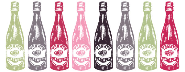
When designing any line of products, you always need to consider things such as: how to design for different flavors in the line, how to make each product individual but part of the same family, how to plan for future line extensions. But when designing for a large line of products, there are unique factors to consider: how to make each product look like part of the same family without feeling repetitious or boring, how to make each product look like they belong to the same family while maximizing their individuality.
- Break it down into categories. Find characteristics that unite similar products within the large group. It is often obvious, but you may have to dig deeper if it’s not. For example, a line of spices could be subcategorized into leafy spices, sweet spices, grilling spices, etc., each category having its own look. This will help the consumer more clearly identify categories of products as well as make the line easier to digest and process both on the retail shelf and in the home when in use.
- Maximize the family tree. In a small line the products are like siblings. In a large line you have groups of siblings, and these groups of siblings are like cousins to each other, all part of the same family line. So identify constants across the entire line for the family look, and then differentiators among the groups for the cousin look, and within the cousin groups identify differentiators that create the sibling differences.
- Strike the right balance. Beware of too much differentiation, which can look busy and disjointed, or too little, which can look stale and boring. You need to strike the right balance—too far in either direction can ruin it. Color often plays an important factor as a strong visual cue to identifying groups and/or flavors, but use color with caution as too much color is something to watch out for.
- Keep it consistent. Keep similar information in the same places on each package. This makes it easy for the consumer to compare and contrast across the line, knowing where to look for similar information on the packages. This subconsciously builds reliability and trust in the brand and product. If there’s too much variation it will make it hard for the consumer to understand and they will quickly move on. Remember, your product only has a 2–3 second window on the retail shelf to make an impression.
- Plan for the future. Always expect that future products will be added to the line. You may think it’s finite now but you don’t want to design yourself into a corner should that need to expand arise down the line. With the right infrastructure in place, the right consistencies and differentiators, you will have a robust framework from which to grow the line as needed.


