So your PDP (principal display panel) worked overtime in getting your potential customer to pick up the product. What needs to happen now in order to get them to buy? Let’s take a look at how the package can further entice and inspire the consumer to action. This is the third in our series on creating packaging that increases sales. (See Part 1 here and Part 2 here)
From here, it’s all about the secondary panels supporting everything that’s been set forth on the PDP with informative, inspiring, useful information.
What goes where. The amount of secondary space and number of areas you have will depend on the size and type of package. On a box for example, you have 4 main panels in this order of prominence:
1. Front: This is the PDP. We’ve already covered what goes here in our second article in this series.
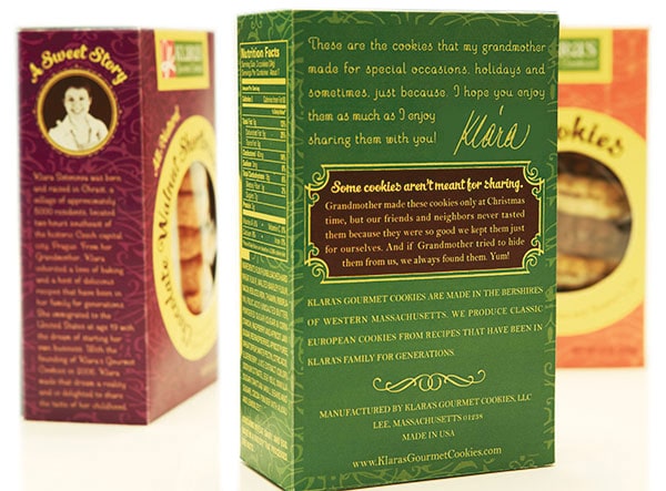
2. Back: You usually have plenty of room here for some romance copy. But don’t just romance for romance’s sake, make sure it keeps focused on the product. If you have room, you can also touch on the company itself while reinforcing the brand message.
3. Left side: This is just the place for an interesting factoid, or aspect of the company. You can also dive deeper into the company for further brand story.
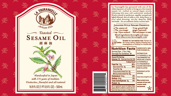
4. Right side: Welcome to the nutritional information panel. Sorry, there isn’t much wiggle room on that. The FDA requires that the information panel be the panel immediately to the right of the PDP. If this panel is not usable due to package construction (e.g., gusseted side panel), then the information panel is the next panel immediately to the right, typically the back panel. The information panel consists of company name and address, ingredients, nutrition facts and any allergy statements if applicable.
On a round container or other package, you may only have front/back panels.
Now that we’re clear on what information goes where on a package, let’s move on to how you can make the most of the available areas on a package.
More room for romance.
You may have a small blurb of romance copy on the front, just the most essential words. The secondary panel is the place to expand upon that. (Or perhaps you opted for no romance on the front due to space or other reason, then the secondary panel is the place for all your romance copy.) Go into more detail here. Perhaps you talk about country of origin, how the product is made or a healthy story. While it’s beneficial to be descriptive, remember that you still need to be brief! Keep in mind the consumer is in the store setting and they are likely strapped for time. Remember, if it’s too hard to read, they’ll just put the package down. You want the romance to be easy to scan, not too long, and so keep it essential and informative.
How does it fit into their life?
Go ahead, be specific. If a product is new or unusual, people won’t know what to do with it. Give them the tools and get them excited about trying something new and different. This can be general info such as “great for baking” or “try in salads.” It does not need to be super-detailed and likely you won’t have room for more detail anyway.
The taste of success.
Recipes are one of the best ways to entice customers. A recipe can get the consumer excited to try something very specific, something they can make right when they get home from the store. And if they need a few extra ingredients, they’re in the right place. If you don’t have room on the package for a recipe, consider a hangtag or foldout label.
Multiply the uses. Multiply the sales.
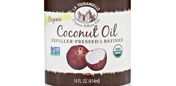
Are there other ways they can use your product? For example, coconut oil found in the culinary aisle is not only for cooking but also great for use on skin and hair, but you won’t find it in the cosmetic aisle. Tell your customer multiple uses to demonstrate how versatile the product is. With multiple uses, they’re more likely to buy.
Your website: the fifth panel.
You probably know it’s a good idea to include a URL on your package. But take it a step further by telling your customer they can find more recipes or find similar products. You may feature the URL in the romance copy. At the end is a good place, to carry the narrative over to the website. You should also consider repeating the url by the company info on the information panel as well, since the consumer might be looking for it there along with the other contact information.
Give them something for free.
The more value you add to your product through the information on the package, the more the consumer is armed and informed. They’ll know what they need to get the most out of the product—and get more bang for their buck.
What problem can you solve?
Address pain points of the consumer and then show how this product can solve their problem.
Encourage the repeat sale.
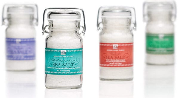
Assuming the product is great, the design is strong, and the copy on point, all components work together in the consumer’s home to encourage a repeat sale. If a product comes in a beautiful package, customers are more likely to keep it on display in their home, not hidden in a cabinet.
The more the consumer sees the package and dwells on the message, the more it sinks in and becomes rooted in their everyday lifestyle.
Invest the time. The first time.
The efforts you invest in creating the design will pay off with results. You’ll enjoy more sales and less down time. And take your time, a well-thought out design won’t need reworking every year.

