You’re a gourmet or specialty brand. You have amazing products, and you want the world to know about them. Your branding includes logo/identity, packaging, website, printed materials and more. How do you put your best face forward across all these channels and ensure seamless branding? Let’s take a look.
Logo
Ideally, the core of your company is encapsulated in your logo—your ethos, vision, mission, values. It’s important to understand that consumers won’t grasp this when they see your logo, but it’s an integral part of your branding, which will ultimately contribute to the consumer’s conscious and subconscious experience regarding your brand. The logo is the keystone in this sense, and everything else in your branding stems from there.
It may sound like you need to pack a lot into your logo in the visual sense, but that is not the case. After looking at all you want to symbolize in your logo, you might arrive at a text-only logo. Or, you may have an idea in mind for your logo but after going through the logo development process you arrive at a completely different place. That’s the beauty of the creative process; sometimes you don’t know where it’s going to take you, but it can result in a solution that surprises you and exceeds expectations.
Packaging
Obviously you need to include your brand logo on your packaging, although in the case of brands with multiple lines you may have multiple logos and sub-brands as well. In any event, as we said above everything stems from the logo, and as you’re building out packaging designs, that is the case quite literally.
But in the figurative sense, keep in mind what was set forth in the logo development and have those tenets hold true here as well. Develop your packaging design according to what you want it to represent, and that will build on those conscious and subconscious experiences for the consumer.
Packaging is often a consumer’s first touch point with a brand, and has only a 2–3 second window on the shelf to make an impression, so appearances are everything here. (For more on how you can make the most of this window, see our Keys to Effective Packaging Design Series.)
Website
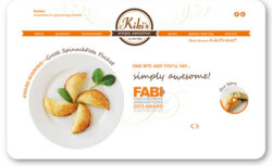
Aside from using your product, the website is where the consumer really interacts with your brand. They may have already experienced your product and want to learn more about your product line and company, or saw your product but didn’t buy and are evaluating first, or the website may be their first impression of your brand from referral or search. Either way, your website users are checking you out. They are judging you here based on ease of use, ability to quickly provide them with the information they are looking for, and overall just generally finding out who you are.
We covered Website Dos and Don’ts for Gourmet Brands in another article, which overviews some key usability aspects. So let’s look at how you can continue your brand experience throughout your website through design and content.
If you already have logo and packaging designed, you’re well on your way to building out your branding. The website at this point should be an extension of that, continuing along the same lines for look and feel. But that doesn’t mean a replication of the design. While it’s important for your branding to look seamless across all channels, replication is boring. Take a slightly different spin here for that element of pleasant surprise.
Usability trumps appearance no matter what though. If you have a great-looking site that is hard to use, it won’t matter—the user will feel frustrated and leave. That said, design is essential. If you have an easy-to-use site that looks terrible, it might be functional but highly unimpressive, leaving the user feeling let down. Both result in a poor brand impression, so it’s all about striking that right balance between the two.
For content, you’ll have the basics such as product selection and contact page (always include where you’re located—if not your address at least city and state—otherwise it looks like you’re hiding something). But your website is the place to infuse your brand story and tell it in full since you have the room and the user can go into as much depth as they like. Why do you do what you do? Share your passion, enwrap them in your vision, and they will become more intertwined with your brand. Include any press and awards which lend credibility.
Your print pieces should support everything else in your branding. You may have an assortment of identity materials, catalog, direct mail, sales sheets and more. Here again keep in mind the freshness aspect of your branding and don’t replicate from your other branding channels. Print tends to have a shorter lifecycle since once something is printed it can’t be changed, so you can play around here and have some fun with branching out a bit from the core branding.
You may also have other channels such as trade show booth design. View each element in your branding as a standalone item (something that might be experienced in isolation from the other branding channels) as well as working into the larger branding picture as a whole. Each item/channel has its own experience and together they all build on the whole package that is your entire branding.


