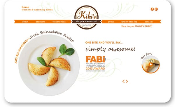
At JDD we are all about breaking conventions when applicable. After all, much like packaging, if everyone is doing one thing, a great way to stand out is by doing something different. However, breaking conventions is not always the best thing to do, as in the case of websites.
We as a general population have come a long way with the web, in terms of both technology as well as our comfort level with using the web and adapting to new trends. But website users expect certain standard conventions to be followed on a website, which make the site easy to use and give a comfort level in using the site and interacting with the site’s brand. Let’s look at a few basics when approaching a website project for your gourmet or specialty brand.
First things first: Your website should have a unique look that reflects your brand in terms of aesthetic, tone, content and usability. However your website should also follow certain conventions such as logo at the top for brand presence, navigation at the top or upper left side as these are usability standards users have come to expect, and consistency of these items across every page. This gives a feeling of normalcy and comfort to the user in addition to being functional. The moment you deviate from these conventions you instill an undercurrent of discomfort, and therefore brand trust is questioned even if on a subconscious level with the user.
Every page is your home page: Upon landing on any page of your site the user should be able to immediately understand who you are and what you do. It is important to note that most users will not land on your home page as their first page. They will be searching for information in a search engine, and what shows up in their search results will likely be a link to a page on your site that is not your home page but a subpage which has the relevant content they are looking for.
Make it easy: Much like considering a shopper in a store when designing a package, consider your user in their environment while browsing your site. The typical web user might be at work, accessing your site on a smartphone—whatever the case, their attention is likely fragmented and they are not looking to be entertained. They are searching for information and just want to get what they need quickly and easily. The better you help them do that, the better their experience is on your site and therefore with your brand.
Tell a story: Also much like a product’s package, your website should tell your unique brand story. Tell that story and inject that brand vibe wherever you can on your website, through the design and copy. This will help create an enriching experience, enhancing the products featured on the website, and captivating your audience even further. Whether they buy or not during that visit, the user will be left with your brand impression in their mind, either consciously or subconsciously.
In a future article we’ll be taking a look at brand consistency across all channels.


